Helping Viewers Save the Music They Love: A UX Case Study on Soundtrack Discovery

I enabled users to save songs they loved - instantly, without leaving the story.
1. Problem
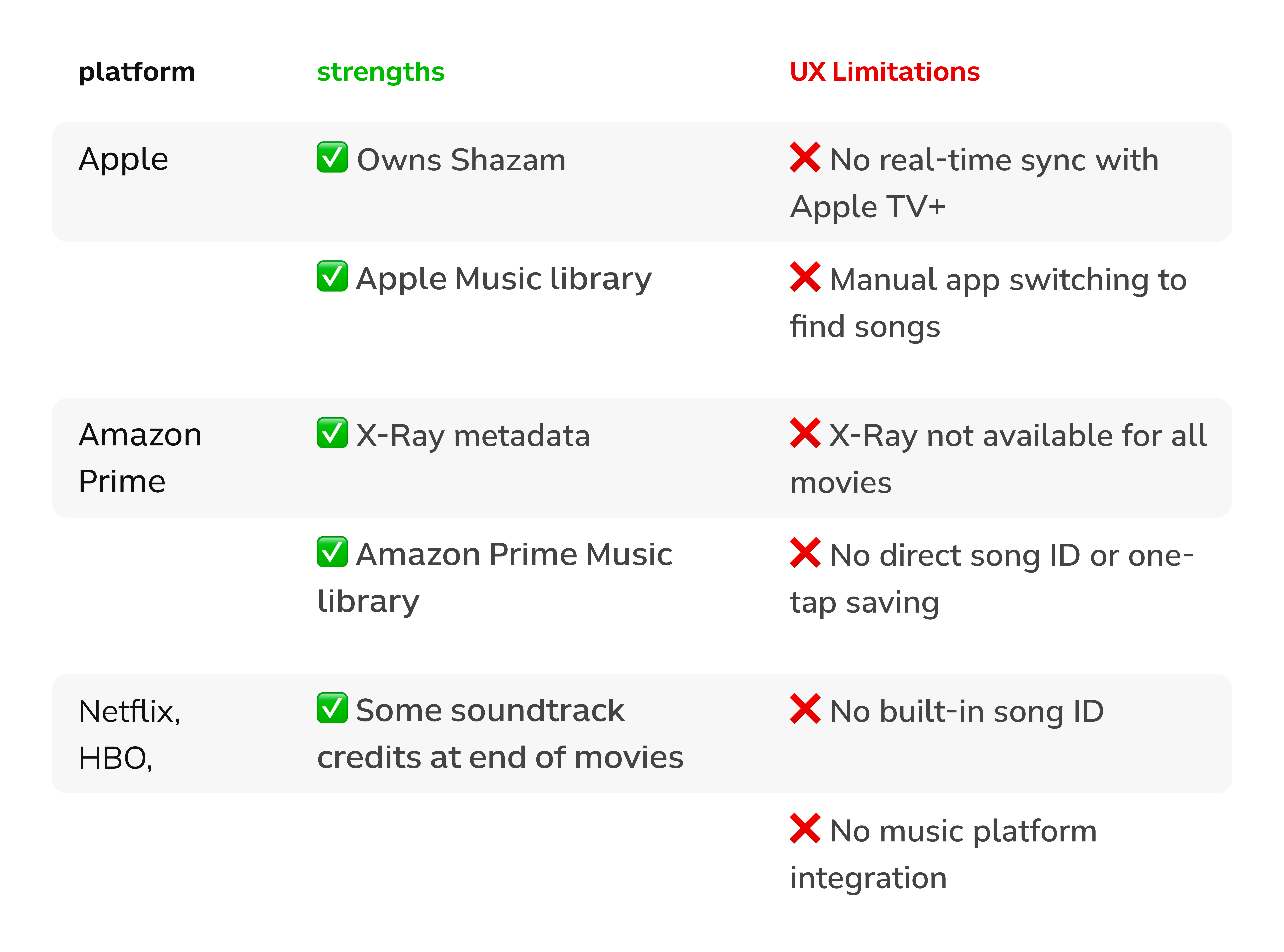
Users couldn’t save a song during a movie without pausing playback on their smartphones, breaking immersion and causing frustration.
2. Insight
90% said music shaped their viewing experience, but 80% didn’t save songs because stopping the video disrupted the flow.
3. goal
Enable users to save a song instantly without interrupting playback.
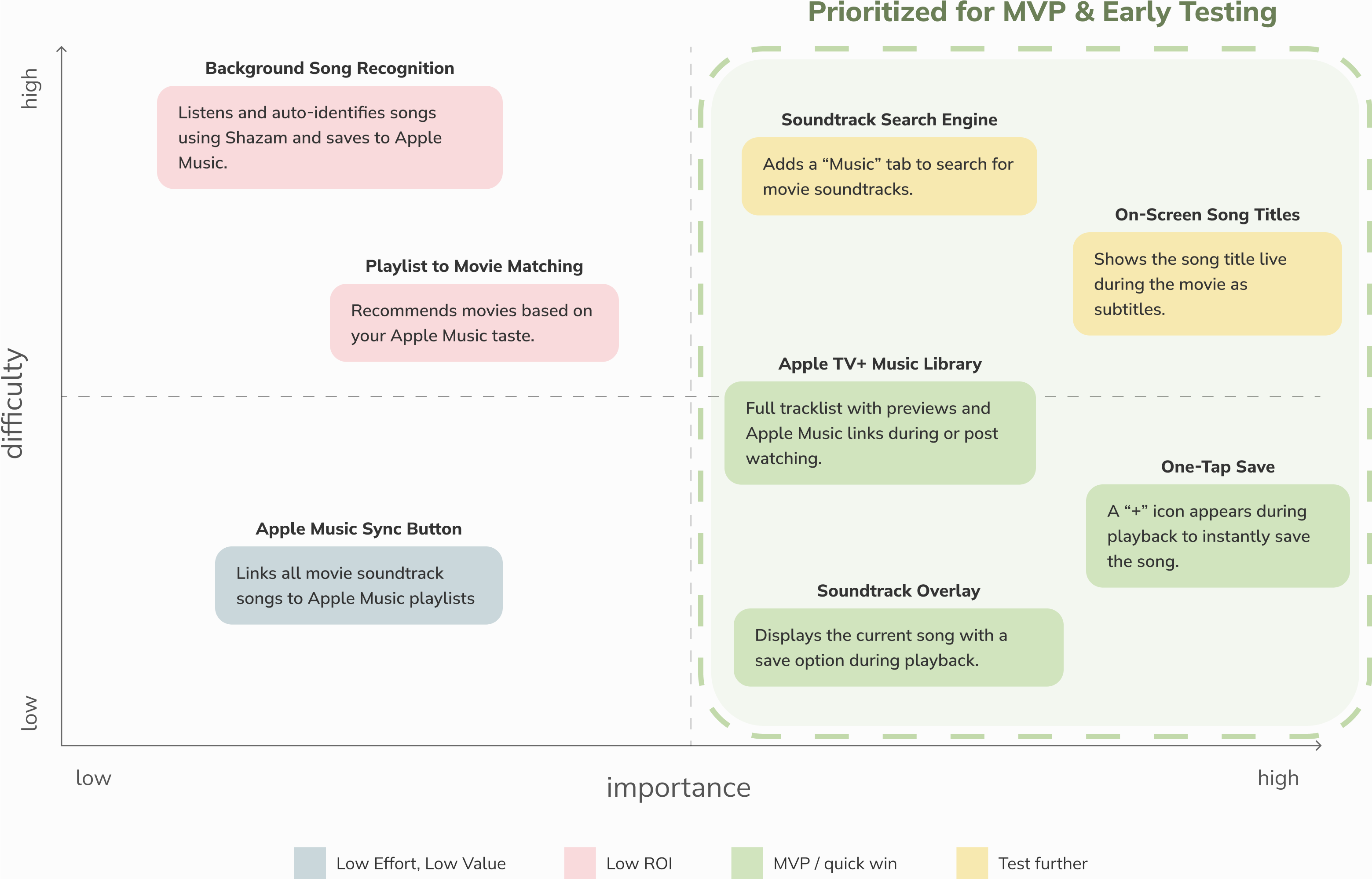
4. SOLUTION
Designed a real-time overlay linked to Apple Music, letting users save songs with one tap without leaving the video.
5. MY ROLE
This was a self-initiated conceptual project. I led the entire UX process, from research and flows to prototyping, user testing, and final UI design.
6. IMPACT (based on testing feedback)
92% task success rate (saving a song during playback). 8 of 10 users expressed intent to subscribe to Apple Music.

When Viewers Love the Music
but Lose the Moment

Interviews revealed that users feel emotionally connected to music,
but can’t act on it without interrupting the experience.

Based on in-depth interviews, I crafted a persona that captured the emotional heartbeat of users. It helped anchor key design decisions around saving music without breaking immersion.
“When I’m watching something at home, I can just Shazam the soundtrack and it’s saved. But on my phone? I usually miss the moment - and forget the song completely.”
- Sarah

Research Proved Viewers Struggle
to Capture Songs They Love

I identified the exact moment users wanted to save a song and couldn’t.

I often found myself loving a song during a movie only to forget it by the end. In interviews with frequent streamers, I heard the same frustration. So I mapped the experience to see where emotional momentum breaks.

I used the insights to map exactly when users felt the urge to save a song  and where the app let them down.
Here's what stood out:
1.
80% tried identifying a song mid-watch on mobile, and failed.
2.
90% said soundtracks matter emotionally.
3.
Users want to save without rewinding, pausing, or leaving the app.
Key insight: UX breaks exactly when emotional engagement peaks and no saving action exists.
Opportunity: Add frictionless saving at the emotional peak with a subtle overlay.

Competitor Analysis Showed Even Big
Platforms Don’t Bridge Movies and Music

I analyzed major platforms to see if any solved
real-time soundtrack saving. None did.

Comparison of leading platforms revealed
missing real-time soundtrack saving.
I wanted to understand if existing platforms already solved the problem. So I analyzed Apple, Amazon, and Netflix to see how they connect music and movies.

What surprised me most?
Even giants like Apple, which owns both Apple Music and Shazam, don’t let users save soundtracks in real time. Most platforms require switching apps or waiting until the end of the movie. That breaks immersion and kills the moment.

Key Insights:
No platform enables seamless, real-time soundtrack saving.

Shaping Problems into Possibilities

To turn frustration into direction, I framed
three HMW questions and explored fast with Crazy 8s.

After 10 interviews and platform reviews, one pattern stood out:
users had no easy way to save songs in the moment they felt most moved.
I wanted to explore a wide range of solutions without rushing into execution. To do this, I prepared HMW questions and ran a rapid ideation session using the Crazy 8s technique, forcing myself to generate 8 unique concepts in 8 minutes - and push beyond the obvious.
This insight led to a key design question: How might we let users save songs instantly – without breaking the story?

To answer it, I analyzed each idea for emotional impact (how much it would improve the user experience) and technical effort (how hard it would be to build).

Mapping them in a difficulty matrix helped me identify quick wins and prioritize the most impactful solutions, so I could deliver value fast without losing sight of bigger opportunities.
Three focused design opportunities emerged:
1.
HMW surface songs unobtrusively?
Show what’s playing without interrupting the scene.
2.
HMW enable one-tap saves?
Capture songs instantly so viewers stay immersed.
3.
HMW unlock discovery from music taste?
Recommend movies based on soundtracks users already love.

Reframing the Problem Opened a Path
to Truly Seamless Soundtrack Discovery

The real problem wasn’t tech - it was the missing link
between the moment of excitement and the action of saving.

Through competitor analysis and 10 user interviews, I uncovered a universal frustration: Users had no seamless way to save a song right when it moved them.

Everyone I spoke to described the rush of excitement when a soundtrack hit – and the frustration of having to pause or fumble with apps, ruining the moment.

As one user said, “Every time I try to find the song, I miss what’s happening in the movie. It ruins the mood.”
This insight led to a key design question: How might we let users save songs instantly – without breaking the story?

To answer it, I analyzed each idea for emotional impact (how much it would improve the user experience) and technical effort (how hard it would be to build).

Mapping them in a difficulty matrix helped me identify quick wins and prioritize the most impactful solutions, so I could deliver value fast without losing sight of bigger opportunities.
Three focused design opportunities emerged:
1.
HMW surface songs unobtrusively?
Show what’s playing without interrupting the scene.
2.
HMW enable one-tap saves?
Capture songs instantly so viewers stay immersed.
3.
HMW unlock discovery from music taste?
Recommend movies based on soundtracks users already love.
This matrix clarified quick wins vs. long-term ideas, guiding me to
solutions with the highest user impact and potential business value.

Filtering What Matters Most

To move from raw ideas to actionable priorities,
I mapped all Crazy 8s concepts on a Difficulty vs. Impact matrix.

With multiple directions on the table, I needed a clear way to compare their potential, not just in terms of creativity, but in terms of actual user value and implementation cost.

One of those tradeoffs?
Choosing between a soundtrack overlay and on-screen song titles, a decision the matrix helped frame.
The matrix helped me:
1.
Identify quick wins for the MVP
2.
Spot high-effort ideas that could be scoped later
3.
Surface early UX tradeoffs worth investigating further.

Making the Right Tradeoff: Overlay vs. On-Screen Title

I chose the overlay over song titles to reduce
friction and protect subtitle readability.

During early prioritization, I initially considered two similar concepts:
While both served the same goal, letting users know what song is playing, I realized that on-screen titles would clash directly with subtitles (which many users rely on, especially when watching with sound off or in different languages).

So I consciously decided to drop on-screen song titles early, and focus on the overlay as the most scalable and user-friendly path forward.

This wasn’t just a design choice - it was a product decision grounded in user behavior.

From HMW to MVP: Designing the First Concepts

These features reduce friction across discovery, engagement, and action
- capturing musical intent without disrupting the moment.

1. Soundtrack Search Engine – Discover Soundtracks Without the Hassle
The Soundtrack Search Engine adds a dedicated Music tab to the search interface, helping users find movie soundtracks without unrelated clutter.

The Music tab follows the existing filter pattern (Top Results / Movies), making it feel familiar and intuitive. It blends seamlessly into the existing UI without requiring users to relearn navigation.
Interaction Summary
1.
The user searches for a movie (e.g. Interstellar).
2.
Switches to the Music tab to filter only soundtracks.
3.
Selects a specific album or track
4.
Can instantly explore or save the song without leaving the app
2. Movie Soundtrack Library
– Full Tracklist Connected to Apple Music

The Soundtrack Library shows a full list of songs from a movie, with 30-second previews and a Play Full Songs button linking directly to Apple Music.

This lets users enjoy or save every track right inside Apple TV+, avoiding the hassle of switching apps.

To help users reconnect with a movie’s music, I added a soundtrack section, featuring the top 3 songs (based on Apple Music plays) directly to the movie detail page.

Users can preview 30 seconds of each track, just like in Shazam, helping them quickly recognize and reconnect with the right song, save it to their Apple Music library, or jump directly to the full track in Apple Music.

Seamlessly linking watching and listening helps drive cross-platform retention within the Apple ecosystem.
Interaction Summary
1.
The user browses a movie detail page before or after watching.
2.
Scrolls to the Soundtrack section, placed alongside other supporting content.
3.
Taps to explore or save full songs, instantly linked with Apple Music.
3. One Tap to Save or Explore
– Instant Action Without Distraction

The Soundtrack Library shows a full list of songs from a movie, with 30-second previews and a Play Full Songs button linking directly to Apple Music.

This lets users enjoy or save every track right inside Apple TV+, avoiding the hassle of switching apps.

To avoid breaking immersion, I designed a minimal overlay that lets users interact with the soundtrack in one tap, without pausing or navigating away.

The lightweight overlay appears only when music plays prominently, blending into the viewing experience while still offering value.
Interaction Summary
1.
Tap the “+” to instantly save the current track to Apple Music.
2.
Tap the overlay to explore the full soundtrack in context.

Test, Learn, Break, Repeat

Prototypes were ready - but would they survive real-life distractions?
I had to find it out.

To validate the prototype in realistic settings, I conducted quick guerrilla usability testing with 6 users across different contexts: at home, during commutes, and in busy environments like cafés and open offices. I chose this approach to see if one-tap saving would remain intuitive even with real-life distractions.


What worked:
✅ Users recognized the current song using the real-time overlay
✅ One-tap saving to Apple Music felt effortless and intuitive
What didn't work:
❌ Users didn’t know where saved tracks ended up.
❌ Many didn’t understand how to access the full soundtrack list

Did It Work? Testing What Mattered Most

Key design changes truly solved the biggest issues users had.

After identifying the most critical usability issues in the initial test, particularly with users struggling to save songs and navigate full soundtracks, I ran a second, focused round of testing.

This time, I invited 4 participants and gave them tasks centered solely around the redesigned interactions.

Key insights:
1.
Simplified affordances work - subtle visual hierarchy and clearer labels helped users know what to tap.
2.
Small UI shifts made a big difference - changing the icon position and label clarified intent.
3.
There’s still room to improve clarity around where saved songs go, but now users at least complete the action confidently.

See my case studies

Designed a behavioral UX model to reduce no-shows by 42%,balancing fairness with client accountability without punishing regulars.

View Case Study
view case study
Fixed a broken reporting flow in a live quality-control system. Introduced structured forms that cut reporting time in half – no redesign, no fluff, just results.
View Case Study

Looking for a designer who brings clarity and usability to your product?
I’m open to freelance, full-time, or creative collaborations.

Let’s make something meaningful together.

Thank you! Your message has been sent!
Oops! Something went wrong while
submitting the form. Try again